Wednesday, January 2, 2013

Depth of Field and Shadows

A Job Well Done

Today we got a great set of examples of masterfully results in terms of depth of field and lighting management. The three exhibits we will present are full of tasteful details and well thought out element interaction, at a simple and friendly budget. Sometimes they say, less is more.

Exhibit A

The subject is not what it seems it is, yet we could say the model is a vital component of the picture. We are analyzing the accessories that are in place, be it the set of shoes, necklaces and lenses.

Two photography elements are key here, the Aperture which controls the blurry background and the subtle shadows coming from behind the model.

For those readers who served in the military, it is plain to see where the cardinal points are located, provided the disambiguation of the 12M effect.
In plain English, you can exactly pin-point the Geo location, except you can make a 180 degrees mistake, which would be subsequently corrected without a doubt.

How? Well, just project the shadow cast by the models leg to the back of the model, towards the light source, and then cross it perpendicularly, almost following the double yellow line on the road. This new virtual compass rose would pin-point the position of North and South (Background/Foreground) and West /East by the model's back and front. All this, provided it is past 12M, otherwise the location would be 180 degrees off.

But beyond military survival tactics, the point is how well managed are the shadows cast by the model, along with the subtle blur caused by the aperture setting. Brilliant.


Exhibit B

This is even a better shot than the first one. All the elements we discussed above, are improved on this new picture. Even the model posing is better, happier and glamorous. But can you see the see elements, aperture and shadow management, talking to each other?

Of course you can, because it is plain to see.

You can still see the shadow cast by the model's legs and these are not strongly defined, yet are visible. The accessories shine and define the look of the outfit and the background blends-in effortlessly.

Like I said before, I like this shot better than the first one, because the discussed elements are taken up a notch. The background is a touch blurrier and this is because the Aperture has been taken up a notch, thus reducing the focal distance.  

It is a great composition also, which leads us to Exhibit C

Exhibit C


My favorite one. First off the landscape configuration is more harmonious than the portrait and that ironically sets the mood for a portrait image.

Lets break it out and elicit the well earned points, plus a qualifier out of my personal opinion, which in this case, matters simply because I am the blog's author.
  • Aperture, Excellent setting.
  • Highlights/Shadows, Awesome.
  • Accessories Selection, Genius.
  • Overall Composition, Great.
Best of all for all the incumbent is, the budget allocation: On Pennies.

Not because you have a full-blown production it means you will achieve the expected results by default. there is still a long way to go before reaching mastery of photography and sometimes you can make it on a tight budget.

The picture above (Exhibit C) may well be the cover of any fashion-related magazine, without any fear of going wrong. All in all, these pictures are good examples of simple things gone great.

Will see you an our next issue.

www.miguelperezphoto.com


We also suggest you to take a look at these links:


Wednesday, December 26, 2012

Bandanna Creativity has Died

Bandanna Photographer Needed


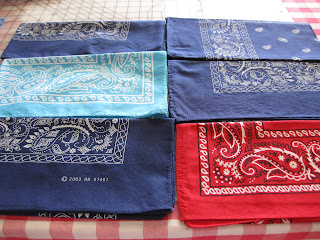
I could not believe my eyes when I first stumbled on these bandanna shots.
Let me explain, if there is ever that one thing so full of color and texture, timeless in style and always sought for in the underground and underground wannabe circles, is the Bandanna.

The amoeba pattern will stay forever, as long as there is cotton and ink, but we are really pushing it in terms of lack of creativity"".

Let me illustrate this better through Exhibit A:


On the right we have a sample of one of the worst examples of creativity and commercial display.

 A set of five bandannas on a wooden background never looked so dull and flavourless, simply because the photographer is on the brink of a strike.

The illumination is not controlled or calculated, obviously resulting in an overexposed condition.

The angle lacks composition as it is in the middle of a plant view and a 3/4s, without personality or meaning.

The decor and arrangement says nothing, it is not a fan yet it is not a perfect stack of bandannas; I really do not know what to make of this shot. In summary, wrong light, wrong angle, wrong layout and particularly, a tasteless touch, that of the pair made out of the made in china  label next to a 99cents cheap statement which could have been driven differently. say no more.

Exhibit B:


Much better than the previous one but still the mistakes are there.

Same problem with the light, not well discussed, overexposed and even though the colors of the products are more cooperative, the layout the angle and concept is of a lesser grade of an elementary project made by a artsy-less student.

It is hard to conceive all these big no-nos together, but here are the exhibits to help make the case.

Nothing justifies the checkered tabletop as background in strong competition with the products, given that both are decorative pieces of colorful fabric. Not a cool look.


Let me finish off with another sample of poor brainstorming, and the one slated for making up this notorious trio.


Exhibit C


By far is the best shot out of the three bad examples. You can easily see there is a glam brand, which means some sense of style and aesthetics lingers behind the making of the shot, however the end result is poor and definitely not professional grade.

I do not have a problem with a black background in this case, but the problem lies in the composition itself. 

Again, the angle is not right, the tilt, the horizon and the layout says do not look at me.

The viewer does not know whether it is a perfect vertical layout, or the camera man missed a touch the perfect cut; or perhaps those extra degrees of rebel look are part of the strategy.

The last harsh comment i will make is that sometimes I feel it is harder to make it wrong than right.

But this is photography, where anything can happen and there is no absolute truth. What is a major faux pas is genius for my neighbour and tolerance and respect is in order. I somewhat repent the boldness of my comments, but still feel an obligation to raise a flag in the name of a better product photography.

I am sure professional product photographer would agree on most of the discussion and also, some of the unaware readers will get more elements of judgement.

Until the next report,

www.miguelperezphoto.com

Commercial Photography

Orlando - Miami, FL


We encourage your comments on the links above.

Tuesday, December 18, 2012

Under, Over and the Right Exposure

For ages we have been hearing the term exposure as one of the key elements in photography and we are about to see it in a simple example, of the three benchmarking points: under, over and the right exposure.

Exhibit A


Not to mention the contrast between the fine cognac accented leather and it poor quality bracket, the picture is overly exposed and the highlights on the leading edge are taking a lot of picture real estate.

Best of all is that a situation like this has an easy fix and it is done by controlling exposure. Either lowering the ISO value, closing the aperture or speeding up the shutter speed.

Just a comment on this picture, it could have been shot against a darker background and probably gotten a richer result.

Exhibit B


It is actually hard to believe that Prada is cutting corners on advertising but in reality this must be due to an amateur photographer who wanted to use a high quality and fashionable product.

The verdict is simple: Underexposed.
We must not be fooled by the logo highlights and a touch of shine on the black matte surface.

Regardless, even with the shadows on the left side, the picture is underexposed. Better yet, is underexposed and poorly illuminated.

Remember that shadows help modeling a subject and still we need the control the projection and intensity of them, by placing the light sources on the right spots.

As I write these lines, I take another look at the logo and as an off the record statement, it seems like a copy-cat issue; Prada, would never lower their marketing standards with a picture like this. Anyhow, thanks to this picture we found a good example for exhibit B.

Exhibit C


The all-time saying of Exposure to the right has made me layout this blog about exposure always to the right, of course in terms of graphic composition.

And it reminds me the importance of the right exposure and the right background.

In this example we have a great representation of both exposure and background.

There are Strong highlights in the right proportion on the leather, there is a great background with a 20+/- % grey and a magnificent ambiance light directly from above.

The later, brings up the illusion of stardom to the product which is treated as royalty by the light beam shining down from the upper side of the scene. It all plays out right.

Remember a simple shot might get a tad complicated but if you star by getting down to the right exposure and right background, you will have a great chance to succeed in the making of it. Until our next issue,

Happy Holidays,


Original www.miguelperezphoto.blogspot.com
 
Architecture www.architecturephotographyflorida.blogspot.com

Product www.productphotographyflorida.blogspot.com
 
 
Commercial www.commercialphotographyinflorida.blogspot.com

Food www.foodphotographyinflorida.blogspot.com


Feel free to send us your comments about the recommended links above.

Monday, November 21, 2011

Too Much, Too Little and Right on

http://miguelperezphoto.com/about-us.html

The rush for a sales boost can lead to a common error called "Too Much" and it usually happens when you are seeing "Too Little". Lets take the example of a chukka boot that looks rather simple and plain to a public avid for adventure.

Probably, it is not going to work. The solution is simple someone says, just add some drama here, more colors there, high gradients, some harsh terrain and you will blow people's socks off.


 This picture might look a tad simple but in my opinion it is a perfect layout to be spiced up with copy text. Nike would go that way too. But temptation is there and in light of illustration my idea, you will see how easy to crossing the lines can be.

Here is the culprit. The whole ad was near ready and now is written off by a series of mistakes. The background is a major player in a picture so don't mess up with it unless you are sure about the consequences. Here, the nice grey gradient is gone and it is replaced by two different gradients from different color families.

Going back to Theory of Color 101, Terra colors have nothing to do with electric blue and possibly that martian red below either. Remember, color should match and enjoy affinity and harmony.

Reading back what I just wrote about too little or too much, feel that no more words are needed as the two pics speak for themselves. Now, my final sample is one of my very favorites and its photographer should deserve an award just because of this shot.

It is simple, well exposed, right angled, well presented, nice distance to subject and the colors do match wonderful. It is an image that sells and it is ready to be dressed up with text. Lovely work, that is what photography was made for.

Until the next issue, all the best.

www.miguelperezphoto.com


Original www.miguelperezphoto.blogspot.com
 
Architecture www.architecturephotographyflorida.blogspot.com

Product www.productphotographyflorida.blogspot.com
 
 
Commercial www.commercialphotographyinflorida.blogspot.com

Food www.foodphotographyinflorida.blogspot.com


Feel free to send us your comments about the recommended links above.


Friday, November 18, 2011

Great Highlights

http://miguelperezphoto.com/sitemap.html
The pictures linked to on this blog are presented as en element of critique and to convey an opinion or point of view. The blog's author presents pictures of his property and others, without claiming or suggesting ownership of  any copyrighted images.


Product photography has a natural cliche ambience that tells the viewer a 30 seconds commercial. The language is different to any other photography category and it is plain to see, no educated eye is required.

You can tell right from the start when a product is expensive, new in the market and even how big the advertising campaign is.

The next picture sugests a few things as per my immediate perception: Affordable,  Unsophisticated.


See how the props define the language? Mixing a flute glass and a raw slice of lime and lemon in a combination that never should ahve happened in the first place, are the cues that tell you this is something informal, refreshing and easy going. However, there is a formal jet black background and lower reflections that suggest some level of glamour. Up to you.


 Speaking of jet black bacground, there are good and bad examples to illustrate when to use a dark background and when not to. This picture is a good example on when not to use a dark background and I will tell you why.

First of all the photography is well executed from the technical point of view, however the body of the product (the bike) is too slim and needs more contrast. Bear in mind that a picture like this has been cookie cuttered and then merged with the background (black) but the editor had the option of using white as well.

Probably, it is an assignment that was originally required on black but again, someone should have proposed the lighter shades in the spirit of getting more contrast for the product.


And my favorite of the night, this eyecup accessory presented in the right setting, a plae shade of gray, well under 18% to the best convenience of the product. I like the framing, wouldnt call it composition yet, and the only negative remark would be that it was not shot in medium or large format. The picture is so good that it deserves better. Great product photography.

Until the next issue, all the best.

www.miguelperezphoto.com


Original www.miguelperezphoto.blogspot.com
 
Architecture www.architecturephotographyflorida.blogspot.com

Product www.productphotographyflorida.blogspot.com
 
 
Commercial www.commercialphotographyinflorida.blogspot.com

Food www.foodphotographyinflorida.blogspot.com


Feel free to send us your comments about the recommended links above.

Tuesday, November 8, 2011

Worst Fonts For Your Products

http://miguelperezphoto.com/weddings.html

It is a new concept this Photoshop system in which a picture is made out of picture elements (pixels) thus it is blending the pictures we knew with new digital pictures which now can be graphics, simply graphics. Pictures and graphics are the same today and that's why I am about to criticize the following pictures.


This is the London's Olympic font and trust me, it cannot get any worse, regardless of the copy, distribution of real estate and overall concept.

It should be removed from the design community with a letter of regret from the creator. 
On the next picture you will find out what I am talking about and more. Read and weep.


But the problem does not stop here, look at the background which could have saved the accident from happening but did not. The obvious question is what the designer was thinking when he envisioned and created the whole rendering and moreover who approved it?

What exactly is the relationship between these colors?
Thought for a moment a worldwide sports event was about pleasant movements in harmony and extreme performance but the image says otherwise.

know that I let the article cool off for a while and then came back to make sure I was not antagonizing with the designer in mention but no, I ma positive this font is the worst ever and please refrain from using it, for your own safety and others too.

Finally, I am not going to make any comments on this Eco-font which could be saved by the purpose and the bell. Rate by yourself and good night.


http://miguelperezphoto.com/sitemap.html

www.miguelperezphoto.com


Original www.miguelperezphoto.blogspot.com
 
Architecture www.architecturephotographyflorida.blogspot.com

Product www.productphotographyflorida.blogspot.com
 
 
Commercial www.commercialphotographyinflorida.blogspot.com

Food www.foodphotographyinflorida.blogspot.com


Thursday, November 3, 2011

Product Photography: The Incredible Scale Models

visit http://miguelperezphoto.com/children.html for a free quote.

.There is nothing more exiting and butterfly triggering than a scale model. Whether you are a boy or a girl it will draw your attention and will leave you speechless for a few seconds as your imagination would need time to catch up with reality.


Lets see exhibit A and get the record straight right from the start: The picture is not real. The car is a scaled replica and the background is a visual illusion. Excellent photo work placing the camera at the right angle, perfect exposure, in focus and even though there is not much of a composition work (it is not needed here) the image looks just right. 


Exhibit B calls for another concept, a very different view, ideal for an advert. What is most impressive to me is the color management as they got the right burgundy hue when it comes to fidelity, and sometimes that is hard to achieve.

The idea of opening the doors but not so the trunk, the hard top on the floor like they are working on the car makes me want to go to the nearest Mazda dealer and get myself a new Miata with hard top. Of course, I totally understand that we are not dealing with the same leave, but still, the Miata is a great option for modern day convertible enthusiasts.


Finally exhibit C shows a beautiful work done on a British Norton Commando, choosing the right color and emphasizing on the cast shadows on the floor.

On a scale motorcycle it is more difficult to achieve credibility because of the level of detail it requires, however in this case, the picture is highly credible because they worked on the important factors, the highlights and shadows. Beautiful degradee grey at aprox. 25%, again great job there.


Until our next blog,

www.miguelperezphoto.com


Original www.miguelperezphoto.blogspot.com
 
Architecture www.architecturephotographyflorida.blogspot.com

Product www.productphotographyflorida.blogspot.com
 
 
Commercial www.commercialphotographyinflorida.blogspot.com

Food www.foodphotographyinflorida.blogspot.com


Feel free to send us your comments about the recommended links above.