Bandanna Photographer Needed
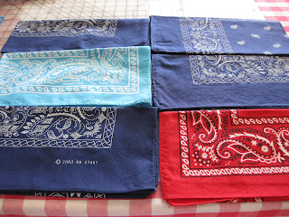
On the right we have a sample of one of the worst examples of creativity and commercial display.
A set of five bandannas on a wooden background never looked so dull and flavourless, simply because the photographer is on the brink of a strike.
The illumination is not controlled or calculated, obviously resulting in an overexposed condition.
The angle lacks composition as it is in the middle of a plant view and a 3/4s, without personality or meaning.
The decor and arrangement says nothing, it is not a fan yet it is not a perfect stack of bandannas; I really do not know what to make of this shot. In summary, wrong light, wrong angle, wrong layout and particularly, a tasteless touch, that of the pair made out of the made in china label next to a 99cents cheap statement which could have been driven differently. say no more.
Exhibit B:
Much better than the previous one but still the mistakes are there.
Same problem with the light, not well discussed, overexposed and even though the colors of the products are more cooperative, the layout the angle and concept is of a lesser grade of an elementary project made by a artsy-less student.
It is hard to conceive all these big no-nos together, but here are the exhibits to help make the case.
Nothing justifies the checkered tabletop as background in strong competition with the products, given that both are decorative pieces of colorful fabric. Not a cool look.
Let me finish off with another sample of poor brainstorming, and the one slated for making up this notorious trio.
Exhibit C
By far is the best shot out of the three bad examples. You can easily see there is a glam brand, which means some sense of style and aesthetics lingers behind the making of the shot, however the end result is poor and definitely not professional grade.
I do not have a problem with a black background in this case, but the problem lies in the composition itself.
Again, the angle is not right, the tilt, the horizon and the layout says do not look at me.
The viewer does not know whether it is a perfect vertical layout, or the camera man missed a touch the perfect cut; or perhaps those extra degrees of rebel look are part of the strategy.
The last harsh comment i will make is that sometimes I feel it is harder to make it wrong than right.
But this is photography, where anything can happen and there is no absolute truth. What is a major faux pas is genius for my neighbour and tolerance and respect is in order. I somewhat repent the boldness of my comments, but still feel an obligation to raise a flag in the name of a better product photography.
I am sure professional product photographer would agree on most of the discussion and also, some of the unaware readers will get more elements of judgement.
Until the next report,
www.miguelperezphoto.com
Commercial Photography
Orlando - Miami, FL
We encourage your comments on the links above.
I could not believe my eyes when I first stumbled on these bandanna shots.
Let me explain, if there is ever that one thing so full of color and texture, timeless in style and always sought for in the underground and underground wannabe circles, is the Bandanna.
The amoeba pattern will stay forever, as long as there is cotton and ink, but we are really pushing it in terms of lack of creativity"".
Let me illustrate this better through Exhibit A:
On the right we have a sample of one of the worst examples of creativity and commercial display.
A set of five bandannas on a wooden background never looked so dull and flavourless, simply because the photographer is on the brink of a strike.
The illumination is not controlled or calculated, obviously resulting in an overexposed condition.
The angle lacks composition as it is in the middle of a plant view and a 3/4s, without personality or meaning.
The decor and arrangement says nothing, it is not a fan yet it is not a perfect stack of bandannas; I really do not know what to make of this shot. In summary, wrong light, wrong angle, wrong layout and particularly, a tasteless touch, that of the pair made out of the made in china label next to a 99cents cheap statement which could have been driven differently. say no more.
Exhibit B:
Much better than the previous one but still the mistakes are there.
Same problem with the light, not well discussed, overexposed and even though the colors of the products are more cooperative, the layout the angle and concept is of a lesser grade of an elementary project made by a artsy-less student.
It is hard to conceive all these big no-nos together, but here are the exhibits to help make the case.
Nothing justifies the checkered tabletop as background in strong competition with the products, given that both are decorative pieces of colorful fabric. Not a cool look.
Let me finish off with another sample of poor brainstorming, and the one slated for making up this notorious trio.
Exhibit C
By far is the best shot out of the three bad examples. You can easily see there is a glam brand, which means some sense of style and aesthetics lingers behind the making of the shot, however the end result is poor and definitely not professional grade.
I do not have a problem with a black background in this case, but the problem lies in the composition itself.
Again, the angle is not right, the tilt, the horizon and the layout says do not look at me.
The viewer does not know whether it is a perfect vertical layout, or the camera man missed a touch the perfect cut; or perhaps those extra degrees of rebel look are part of the strategy.
The last harsh comment i will make is that sometimes I feel it is harder to make it wrong than right.
But this is photography, where anything can happen and there is no absolute truth. What is a major faux pas is genius for my neighbour and tolerance and respect is in order. I somewhat repent the boldness of my comments, but still feel an obligation to raise a flag in the name of a better product photography.
I am sure professional product photographer would agree on most of the discussion and also, some of the unaware readers will get more elements of judgement.
Until the next report,
www.miguelperezphoto.com
Commercial Photography
Orlando - Miami, FL
We encourage your comments on the links above.


